Part 1: Perspective
Sketchbook work
Get ready to see the world like youve never done before!
Only joking, I love perspective, and have done for years! That's not to say iv'e not learned anything new on this project! While I have a firm understanding of 1 and 2 point perspective, I have only dabbled with 3,4 and 5 point, and doing this sketchbook work was a good chance to dip my toe in a bit deeper, and also have some fun!
Only joking, I love perspective, and have done for years! That's not to say iv'e not learned anything new on this project! While I have a firm understanding of 1 and 2 point perspective, I have only dabbled with 3,4 and 5 point, and doing this sketchbook work was a good chance to dip my toe in a bit deeper, and also have some fun!
|
One skill that I have learned from this brief is the use of thumbs and angles to help translate real life onto a page. Doing this still life that you can see is also something I dont do much of, so the whole process was quite eye-opening!
Im still getting used to the whole proportions judging process, but its certainly a technique that I intend to incorperate into future work. |
I further took the life study skills to test when I drew my class mates and friends. i aimed to not only capture their likeness, but also place them in their surroundings in a realistic way, making sure that their bodies were meshing with the perspective of the scnenery.
Photo studies
Artists
Useful videos
Example of an experimental perspective sketch
Part 2: Thumbnails
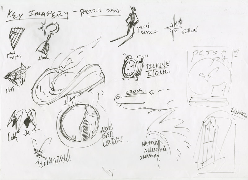
For the second part of this project we were asked to do a thumbnail-focused design process for a play poster. The play I chose was peter pan (because I adore the story).
I started ofwith some light research, familiarising myself with the imagery, then after sketching out some key images, I moved on to drawing a strong 40 thumbnails. While I enjoyed most of the designs, as I got closer towards the 40 mark, I did feel like the ideas were getting weaker as a whole. This was maybe to do with either burnout, or a rigid mindset. I think perhaps a bit of both.
I started ofwith some light research, familiarising myself with the imagery, then after sketching out some key images, I moved on to drawing a strong 40 thumbnails. While I enjoyed most of the designs, as I got closer towards the 40 mark, I did feel like the ideas were getting weaker as a whole. This was maybe to do with either burnout, or a rigid mindset. I think perhaps a bit of both.
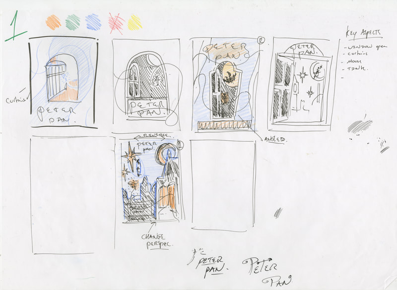
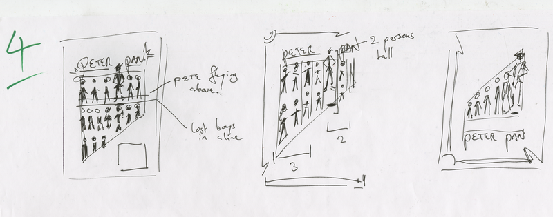
Once I was happy with my base design ideas, I picked out a few thumbnails and developed them, adding indication of tone, more detailed composition ideas, and also re-arranging the key components so that they were fine tuned and conveyed their ideas clearly. The only weakness with these drafts id say is that I used pencil colours to indicate tone. they are not the clearest when it comes to indicating bold visuals, but other than that, I was happy with my final designs.
Then of course came the final designs! As mentioned before, I think the use of pencil colours is the weak point of these pieces. That said, they are helped by the bolder black tones, which I think help make them stand out in their own way.
The only other aspect I'd comment on is my typography, as I was going for a slender, energetic type, with flourishes, it was difficult to get it looking both energetic, but also crisp and clean.
perhaps this was something I couldve developed more in the thumbnails.
but overall I'd say that im happy with the compositions, and have taken a newfound appreciation to how materials are especially important, even when conveying very simple information.


