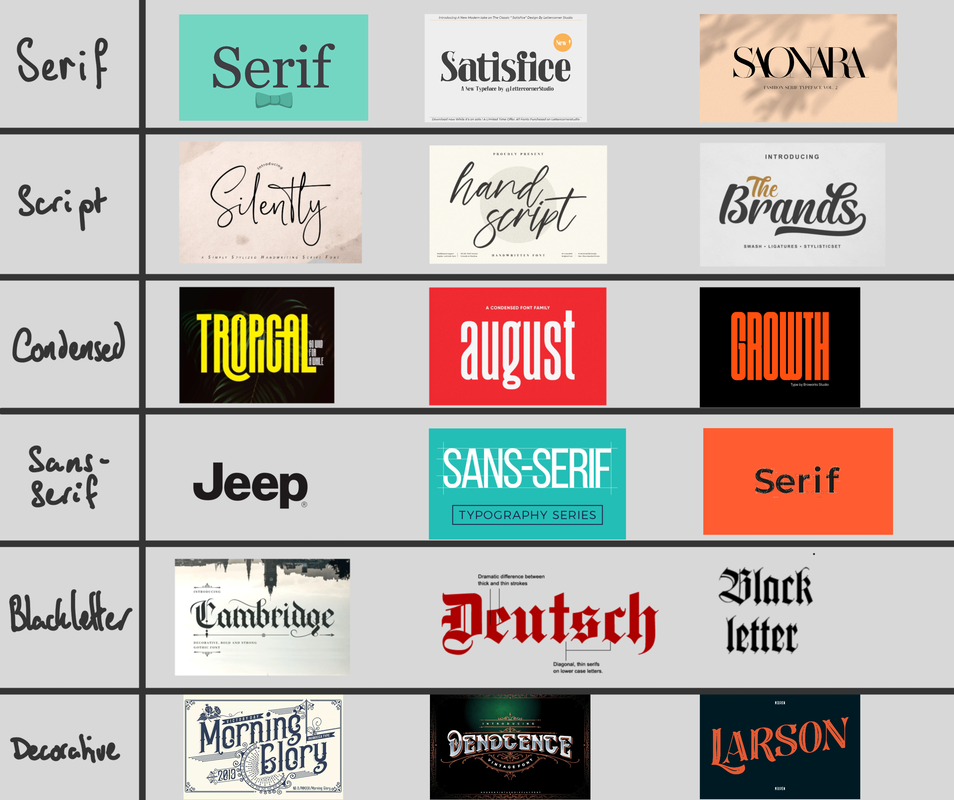
2.Examples of classifications
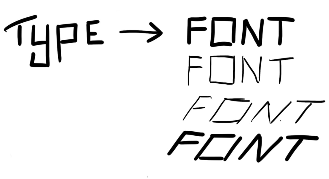
3.The difference between type and font
4. Typefaces from oldest to newest
8. Baskerville
7. Franklin Gothic
6. Futura
5. Gill Sans
4. Times New Roman
3. Rockwell
2. Verdana
1. Gotham
7. Franklin Gothic
6. Futura
5. Gill Sans
4. Times New Roman
3. Rockwell
2. Verdana
1. Gotham
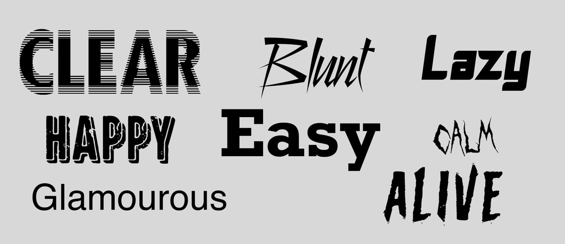
5. Typefaces with opposite personalities
6. The 10 commandments
Put simply, the article we were asked to look at covered some golden rules when it comes to type. They are as follows;
1. Default kerning is a bad idea. Don’t trust a computer to tell you what looks good, use your own judgement to decide.
2. Too much script font is an eyesore
3. Type on a busy background is also an eyesore
4. Using more than typically 2 fonts makes a comp look crowded
5. Small caps have to be baked in to the font for them to look natural. Otherwise it will read strangely.
6. Italics also have to be baked in to look natural. Don’t fake it!
7. ALL CAPS LOOKS REALLY BAD MOST OF THE TIME.
8. Reversing the colours of a type doesn’t make it easier to read.
9. Keep serifs with serifs and sans serifs with sans serifs.
10. Know your line length. Too many words and the text will drag. Too few and it will be hard to string the sentence together.


